7 Performing some useful analyses in R
I’m going to give some examples of how to do common analyses you’ll need for this class. I won’t be spending much time on the statistical assumptions or diagnostics.
library(tidyverse)
library(cowplot)
theme_set(theme_cowplot())
lizards <- read_csv("example_data/anoles.csv") # See Appendix A if you don't have this data
7.1 A note on factors
R has two ways of representing textual data: character vectors (also called strings) and factors.
- Character vectors are just text; they have no inherent underlying meaning.
- Factors are a data type with a specific number of levels; they’re often used to represent different experimental treatments. Examples could include {low, medium, high} or {control, treatment}. Each level of a factor is associated with a number.
For the most part, it’s easier and safer to work with character vectors. Most functions we’ll be using know how to convert them when it’s necessary.
One important thing to note is that ggplot arranges character vectors alphabetically on its categorical scales, but orders factors by their level number. Thus, to change the order of categorical x-axes (and other scales), you need to make your categories into a factor. This is done with the fct_inorder, fct_infreq, and related functions, which are part of the forcats package and loaded with tidyverse. The easiest one to use is fct_inorder, which changes the level values to be in the order of your data; when combined with arrange() and other dplyr functions, this is quite flexible and powerful. For more information on these and other factor functions, take a look at the forcats website.
If you want to manually create a factor, you can use the factor command, which is in base R (no package).
color_levels = c("Red","Green","Blue")
# Randomly select 20 colors from color_levels
color_example = sample(color_levels, size = 20, replace = TRUE)
color_example
##  [1] "Green" "Blue"  "Green" "Green" "Blue"  "Green" "Green" "Green" "Blue"
## [10] "Blue"  "Red"   "Blue"  "Green" "Green" "Blue"  "Green" "Red"   "Blue"
## [19] "Blue"  "Blue"

# Convert it into a factor
color_as_factor = factor(color_example, levels = color_levels)
color_as_factor
##  [1] Green Blue  Green Green Blue  Green Green Green Blue  Blue  Red   Blue
## [13] Green Green Blue  Green Red   Blue  Blue  Blue
## Levels: Red Green Blue
7.2 Comparing categorical frequencies (Contingency Tables & related analyses)
These tests generally compare the frequencies of count data.
7.2.1 Contingency Tables
The easiest way to make a contingency table is from a data frame where each column is a categorical variable you want in the table & each row is an observation. Let’s say we wanted to create a color morph by perch type contingency with our lizard data.
color_by_perch_tbl <- lizards |>
  select(Color_morph, Perch_type) |> # select only the columns you want
  table()  # feed them into the table command
color_by_perch_tbl
##            Perch_type
## Color_morph Building Other Shrub Tree
##       Blue        17    41    27  130
##       Brown       31    25    25  140
##       Green       30    25    32  134
If you want to switch your contingency table from counts to frequencies, just divide it by its sum:
color_by_perch_tbl / sum(color_by_perch_tbl)
##            Perch_type
## Color_morph   Building      Other      Shrub       Tree
##       Blue  0.02587519 0.06240487 0.04109589 0.19786910
##       Brown 0.04718417 0.03805175 0.03805175 0.21308980
##       Green 0.04566210 0.03805175 0.04870624 0.20395738
7.2.2 Chi-squared & Fisher’s Exact Tests
Once you have a contingency table, you can test for independence between the rows and columns. This provides you with your test statistic (X-squared), degrees of freedom, and p-value.
chisq.test(color_by_perch_tbl)
##
##  Pearson's Chi-squared test
##
## data:  color_by_perch_tbl
## X-squared = 11.603, df = 6, p-value = 0.07143
Chi-squared tests assume that there’s at least five observations in each cell of the contingency table. If this fails, then the resulting values aren’t accurate. For example:
site_a_contingency <- lizards |>
  filter(Site == "A") |> # cut down the data size
  select(Color_morph, Perch_type) |> # select only the columns you want
  table()  # feed them into the table command
print(site_a_contingency)
##            Perch_type
## Color_morph Building Other Shrub Tree
##       Blue         1     3     1    5
##       Brown        0     0     2   11
##       Green        1     1     0    1
chisq.test(site_a_contingency)
## Warning in chisq.test(site_a_contingency): Chi-squared approximation may be
## incorrect
##
##  Pearson's Chi-squared test
##
## data:  site_a_contingency
## X-squared = 9.752, df = 6, p-value = 0.1355
Note the warning that “Chi-squared approximation may be incorrect.” In this case, it’s a good idea to run the Fisher’s exact test, which investigates the same null hypotheses, but works with low counts. Fisher’s test is less powerful than the Chi-squared test, so it should only be used when it’s the only option.
fisher.test(site_a_contingency)
##
##  Fisher's Exact Test for Count Data
##
## data:  site_a_contingency
## p-value = 0.06251
## alternative hypothesis: two.sided
You can also run a chi-squared or Fisher’s exact test directly on two vectors or data frame columns:
chisq.test(lizards$Color_morph, lizards$Perch_type)
##
##  Pearson's Chi-squared test
##
## data:  lizards$Color_morph and lizards$Perch_type
## X-squared = 11.603, df = 6, p-value = 0.07143
7.3 Linear Models: Regression, ANOVA, and t-tests
Linear regression and Analysis of Variance (ANOVA) are both special cases of the general linear model (LM), which fits a continuous response (y) to one or more predictors (x). You specify linear models in R with a formula syntax, which generally follows as: response ~ predictor. Combining this formula with the lm() function and a datset gives you the basis of a linear model.
7.3.1 Regression
Lets say we wanted to see how snout-vent length (SVL) affects mass:
simple_reg <- lm(Mass ~ SVL, data = lizards)
simple_reg
##
## Call:
## lm(formula = Mass ~ SVL, data = lizards)
##
## Coefficients:
## (Intercept)          SVL
##     1.62577      0.08886
By default, this creates an LM object, which tells us the regression coefficients. For a linear regression (continuous response), these tell us the regression equation; in this case, that for every \(1 \text{ mm}\) increase in SVL, mass increases by \(0.089 \text{ g}\). Note that in this case, it may make sense to re-scale SVL to be in cm, so that the coefficient would be easier to interpret (e.g., use lizards |> mutate(SVL_cm = SVL/10). To extract the coeficients directly, use:
coef(simple_reg)
## (Intercept)         SVL
##   1.6257700   0.0888617
For more information, use the summary function:
summary(simple_reg)
##
## Call:
## lm(formula = Mass ~ SVL, data = lizards)
##
## Residuals:
##     Min      1Q  Median      3Q     Max
## -2.2672 -0.4699 -0.0530  0.3959  5.6050
##
## Coefficients:
##             Estimate Std. Error t value Pr(>|t|)
## (Intercept) 1.625770   0.210781   7.713 4.59e-14 ***
## SVL         0.088862   0.003434  25.874  < 2e-16 ***
## ---
## Signif. codes:  0 '***' 0.001 '**' 0.01 '*' 0.05 '.' 0.1 ' ' 1
##
## Residual standard error: 0.7661 on 655 degrees of freedom
## Multiple R-squared:  0.5055, Adjusted R-squared:  0.5047
## F-statistic: 669.5 on 1 and 655 DF,  p-value: < 2.2e-16
The most important components of this are the \(R^2\) (which is listed as Multiple R-squared), the standard errors and p-values for each of your coefficients (Coefficients section), and the overall F-statistic and p-value (the last line).
A quick note on p-values:
- Don’t base all of your interpretation on p-values; the \(R^2\) and adjusted \(R^2\) of a model are more important.
- The overall p-value relates to how the whole model explains the variance in the data; the coefficient p-value relates to whether the specific coefficient is different from zero.
- Coefficient-level p-values tend to be rather fragile, and shouldn’t be used.
7.3.1.1 Plotting linear regressions
For a simple linear regression, ggplot can automatically plot the trendline (a.k.a., fitted values) and confidence intervals with geom_smooth().
lizards |>
  ggplot() +
  aes(x = SVL, y = Mass) +
  geom_point() +
  geom_smooth(method = "lm", # use a linear regression
              se = TRUE, # Include a confidence interval around the line
              level = .95) # the level of the confidence interval; default = 95%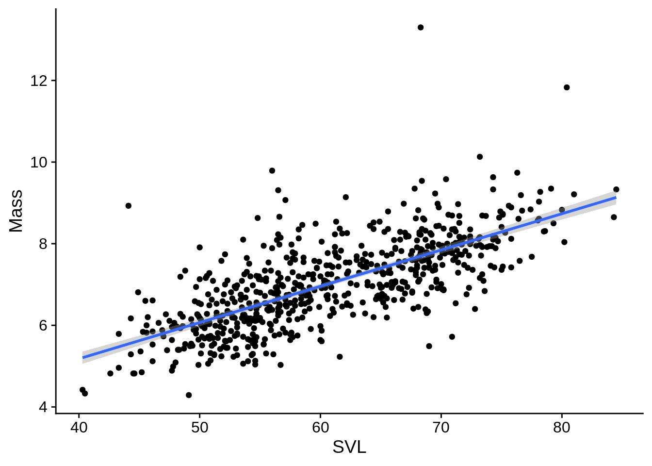
For more complicated models, this approach may not work very well; it can be helpful to calculate the fitted values & confidence intervals from the model object and plot them directly.
You can get these values directly with the predict() function. The code below calculates the trendline and 95% confidence interval for the regression, and adds them to a data frame with the original data.
simple_reg_predictions <- simple_reg |>
  # Predict fitted values wish 95% confidence intervals
  predict(interval = "confidence", level = .95) |>
  # The output of predict() is a matrix; that's hard to work with, so...
  as_tibble() # we convert the output of predict() to a data frame (tibble)
simple_reg_plot_data <- lizards |>
  select(SVL, Mass) |> # we only need these columns
  bind_cols(simple_reg_predictions) # adds columns of simple_reg_preds to our lizards
View(simple_reg_plot_data)| SVL | Mass | fit | lwr | upr |
|---|---|---|---|---|
| 61.8 | 6.46 | 7.117423 | 7.058313 | 7.176533 |
| 57.1 | 5.82 | 6.699773 | 6.636126 | 6.763420 |
| 49.1 | 4.29 | 5.988879 | 5.890800 | 6.086959 |
| 51.2 | 5.29 | 6.175489 | 6.088343 | 6.262634 |
| 51.5 | 5.69 | 6.202147 | 6.116487 | 6.287808 |
| 45.3 | 5.84 | 5.651205 | 5.531606 | 5.770804 |
| 49.7 | 5.91 | 6.042196 | 5.947328 | 6.137065 |
| 48.0 | 5.09 | 5.891132 | 5.787013 | 5.995249 |
| 54.9 | 7.20 | 6.504277 | 6.433552 | 6.575002 |
| 52.7 | 6.66 | 6.308782 | 6.228823 | 6.388740 |
To plot this, you’d use a combination of geom_line() for the fitted values and geom_ribbon(), which would create the confidence interval region.
ggplot(simple_reg_plot_data) +
  aes(x = SVL) +
  geom_point(aes(y = Mass), color = "cornflowerblue") +
  geom_ribbon(aes(ymin = lwr, ymax = upr),
              fill = alpha("black", .2),  # dark fill with 80% transparency (alpha)
              color = grey(.4), # dark-ish grey border line
              linetype = 2) +   # dotted border line
  geom_line(aes(y = fit))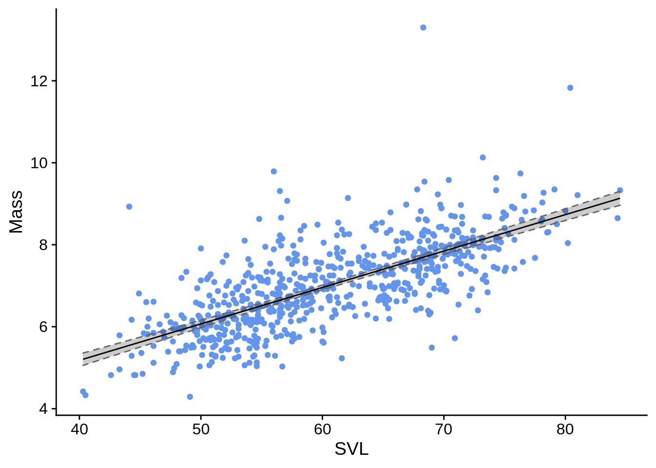
You can also use predict() to calculate the respected value of your response variable given new predictor(s); this is useful for interpolation and extrapolation.
# Create a data frame with new predictors
svl_predictors = tibble(SVL = c(20, 150, 600)) # New predictors
mass_predictions <- predict(simple_reg,
                           newdata = svl_predictors)  # The newdata argument is key here
                                                      # If unspecified, it uses the original data
svl_predictors |>
  mutate(Mass_estimate = mass_predictions)
## # A tibble: 3 × 2
##     SVL Mass_estimate
##   <dbl>         <dbl>
## 1    20          3.40
## 2   150         15.0
## 3   600         54.9
For more information, see the help page ?predict.lm.
7.3.2 ANOVA
Analysis of variance (ANOVA) is a special case of linear model where all of the predictors are all categorical. However, ANOVAs are usually treated differently from regressions for historical reasons. In R, you fit an ANOVA in the same way as a regression (with the lm() command); however, it’s common to use the aov() command on the lm’s output to reformat the results into a more traditional style. For the simple (one-way) ANOVA follows:
# Fit the model wtih a regression
simple_anova_lm <- lm(Diameter ~ Color_morph, data = lizards)
# Reformat into traditional ANOVA style; this is usually done with a pipe as part of the previous step
simple_anova <- aov(simple_anova_lm)

# Look at the ANOVA table
simple_anova |> summary()
##              Df Sum Sq Mean Sq F value Pr(>F)
## Color_morph   2  50586   25293   985.2 <2e-16 ***
## Residuals   654  16790      26
## ---
## Signif. codes:  0 '***' 0.001 '**' 0.01 '*' 0.05 '.' 0.1 ' ' 1
The ANOVA table gives us estimates of variation explained by the predictor and the residuals. Note how different the output is from the summary of a regression, even though the underlying math is the same:
summary(simple_anova_lm)
##
## Call:
## lm(formula = Diameter ~ Color_morph, data = lizards)
##
## Residuals:
##      Min       1Q   Median       3Q      Max
## -14.8837  -3.1176  -0.1176   3.1163  18.1163
##
## Coefficients:
##                  Estimate Std. Error t value Pr(>|t|)
## (Intercept)       32.8837     0.3456   95.16   <2e-16 ***
## Color_morphBrown  -8.7661     0.4854  -18.06   <2e-16 ***
## Color_morphGreen -21.4086     0.4854  -44.11   <2e-16 ***
## ---
## Signif. codes:  0 '***' 0.001 '**' 0.01 '*' 0.05 '.' 0.1 ' ' 1
##
## Residual standard error: 5.067 on 654 degrees of freedom
## Multiple R-squared:  0.7508, Adjusted R-squared:   0.75
## F-statistic: 985.2 on 2 and 654 DF,  p-value: < 2.2e-16
Two quick notes about this:
- While \(R^2\) isn’t included in the
aov()summary, it can be calculated as the total sum of squares of your predictors (in this case, Color_morph) divided by the total sum of squares including the residual; For this example, we have \(5.0586239\times 10^{4} / (5.0586239\times 10^{4} + 1.6790147\times 10^{4}) = 0.7508007\).
- The
aov()table provides a line for each predicting factor and the residuals; thelm()summary includes estimates for the intercept and the specific levels of the factors (e.g.,Color_morphBrown). These represent the dummy coded variables that R uses under the hood; you don’t need to worry about this, but I’ve got an explanation for them below if you’re interested.
Dummy coding: R converts an ANOVA into a (multiple) regression model by changing a categorical predictor with \(n\) levels into \(n-1\) predictor variables that can have values of 0 or 1. The first level of the factor doesn’t get a dummy variable; its mean is represented by the regression’s intercept. The other dummy coefficients represent the mean difference between the reference level and the level they represent. In our example, the reference category is Blue, so the regression’s intercept is the mean Diameter for blue lizards. The average value for brown lizards would be the intercept plus the Color_morphBrown coefficient (and similarly for green). The aov() function reinterprets the dummy coded results as a traditionally categorical analysis.
7.3.2.1 ANOVA means & confidence intervals
# make a data frame with just your predictors (distinct removes duplicates)
color_levels <- lizards |> distinct(Color_morph)
color_levels
## # A tibble: 3 × 1
##   Color_morph
##   <chr>
## 1 Green
## 2 Brown
## 3 Blue

simple_anova_means <-
  # Calculate means & 95% CI
  predict(simple_anova, newdata = color_levels,
                             interval = "confidence", level = 0.95) |>
    as_tibble() |>  # Convert to data frame
    bind_cols(color_levels) # add the prediction data as more columns
simple_anova_means
## # A tibble: 3 × 4
##     fit   lwr   upr Color_morph
##   <dbl> <dbl> <dbl> <chr>
## 1  11.5  10.8  12.1 Green
## 2  24.1  23.4  24.8 Brown
## 3  32.9  32.2  33.6 Blue
7.3.2.2 Post-hoc tests
In general, the ANOVA tests whether a factor (such as color morph) explains a significant amount of variation in the response. To test whether there are significant differences between specific levels of a factor, you need to run post-hoc tests on your ANOVA. A common post-hoc is Tukey’s HSD (honest significant difference).
simple_anova |> TukeyHSD()
##   Tukey multiple comparisons of means
##     95% family-wise confidence level
##
## Fit: aov(formula = simple_anova_lm)
##
## $Color_morph
##                   diff        lwr        upr p adj
## Brown-Blue   -8.766074  -9.906219  -7.625929     0
## Green-Blue  -21.408608 -22.548753 -20.268463     0
## Green-Brown -12.642534 -13.774806 -11.510261     0
You can use the witch argument to specify specific level comparisons, but by default it compares all of them.
A traditional way of summarizing post-hoc tests is to assign one or more letters to significantly different levels, where levels with different letters are significantly different from each other. For example, the letter grouping c("A", "AB", "B", "C") would indicate that group 1 and group 3 are different from each other, but not from group 2; group 4 is different from everything. In the above example, everything is different, so we could assign the letters A through C.
# We'll store these in a data frame for later use
anova_means_letters <- simple_anova_means |>
  arrange(Color_morph) |> # These will be plotted alphabetically, so we'll sort them that way to keep things easy
  mutate(anova_labels = c("A", "B", "C"))
anova_means_letters
## # A tibble: 3 × 5
## fit lwr upr Color_morph anova_labels
## <dbl> <dbl> <dbl> <chr> <chr>
## 1 32.9 32.2 33.6 Blue A
## 2 24.1 23.4 24.8 Brown B
## 3 11.5 10.8 12.1 Green C7.3.2.3 Plotting ANOVAs
The basics of plotting ANOVA results was covered in the last part of Section @ref(ggp_discx_conty), but we’ll refine them a bit here. The main additions are the use of geom_text() to include the labels above each category and scale_y_continuous, which we use to customize the y axis a bit so that it doesn’t cut off the labels. Be sure to indicate in your figure captions what the letters mean.
library(ggforce) # for geom_sina()
# We're going to add post-hoc letters to this plot
letter_y_position <- max(lizards$Diameter) * 1.05 # Put letters at the top

anova_plot <- ggplot(lizards) +
  aes(x = Color_morph) + # Color_morph column is in both lizards AND anova_means_letters
  # Show the raw data
  geom_sina(aes(y = Diameter), # Diameter column is in lizards data frame
            color = alpha("blue", .2)) +  # semi-transparent points
  geom_errorbar(
    aes(ymin = lwr, ymax = upr), # columns lwr and upr are in anova_means_letters
    data = anova_means_letters,    # Use the summary data frame instead of lizards
    color = "black",
    width = .3 # How wide the error bars are
  ) +
  geom_point(aes(y = fit), # fit column is in anova_means_letters
             color = "black", size = 2,
             data = anova_means_letters) +
  geom_text(aes(label = anova_labels), # label is the aesthetic used to indicate text
            y = letter_y_position, # This is a fixed spot, not an aesthetic
            fontface = "bold",
            size = 6, # font size
            data = anova_means_letters) +
  scale_y_continuous(
    # insure the letters aren't cut off at the top
    limits = c(NA, letter_y_position), # This is the same as ylim()
    breaks = seq(from = 0, to = 50, by = 10), # set axis ticks every 10 points
    name = c("Perch Diameter (mm)") # this is the same as ylab()
  ) +
  xlab("Color Morph")
anova_plot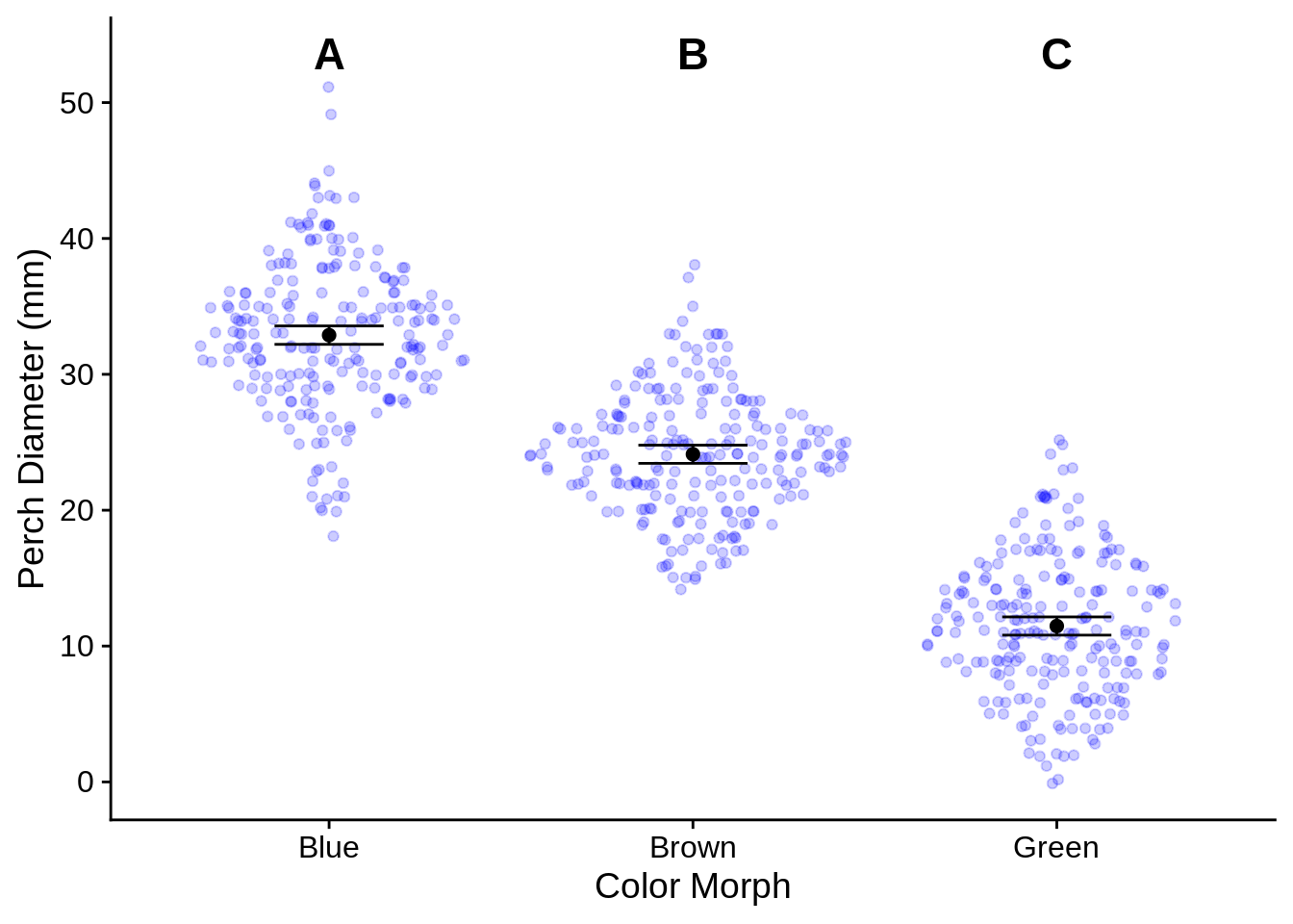
7.3.3 Comparing two means (t-tests)
While it’s perfectly valid to use an ANOVA to compare the means of two samples, the t-test is a more traditional approach. You can do this with the t-test() function.
First, let’s create a 2-level categorical variable to work with. Normally, this would be done during data collection, but there aren’t any in this data source. Let’s define lizards as big (SVL >= 65 mm) or small (SVL <= 55 mm) and remove the intermediates.
lizards_by_size <- lizards |>
  filter(SVL <= 55 | SVL >= 65) |>  # Remove the lizards of intermediate size
  mutate(Size_class = if_else (SVL >= 65, "big", "small") )# Define Size_class as big or small, based on SVL
Next, let’s use a t-test to see if limb length differs between big and small lizards. First, we should look at the mean and standard deviation of each group. The classic t-test requires that the variances of the two groups are equal; if not, an adjustment will need to be applied. In practice, this adjustment has no ill effect if the variances are equal, so you may as well apply it. In any case, it’s a good idea to look at data summaries before running a test.
lizard_size_sumary_table <- lizards_by_size |>
  group_by(Size_class) |> # We want to summarize each size class
  summarize(mean = mean(Limb), sd = sd(Limb), var = var(Limb), n = n()) |>
  ungroup()
lizard_size_sumary_table
## # A tibble: 2 × 5
## Size_class mean sd var n
## <chr> <dbl> <dbl> <dbl> <int>
## 1 big 15.1 0.984 0.969 240
## 2 small 11.2 0.800 0.641 206In this case, the standard deviations are somewhat different, but not particularly. In any case, we’ll run the test without assuming for equal variances.
lizard_t_test <-  t.test(Limb ~ Size_class, # formula specifies response (on left) and predictor (on right)
                         data = lizards_by_size,
                         var.equal = FALSE) # Assume unequal variances; this is the default option.
print(lizard_t_test)
##
## Welch Two Sample t-test
##
## data: Limb by Size_class
## t = 45.668, df = 442.74, p-value < 2.2e-16
## alternative hypothesis: true difference in means between group big and group small is not equal to 0
## 95 percent confidence interval:
## 3.694599 4.026898
## sample estimates:
## mean in group big mean in group small
## 15.09958 11.23883When reporting a t-test, you should t, the degrees of freedom, the p-value, the effect size (Cohen’s d). The effect size isnt’ provided for you directly, so you’ll need to calculate it yourself.
7.3.3.1 Effect size: Cohen’s d
Cohen’s d is essentially a standardized way of measuring the difference between two groups. Conceptually, it’s the number of standard deviations of difference between the two groups. You can calculate it by taking the difference in the group means and dividing by the pooled standard deviation. To get the pooled standard deviation, calculate the weighted average of the variance (weighted by population size) and take the square root.
lizard_size_sumary_table |>
  summarize(mean_diff = diff(mean),
            pooled_variance = sum(var * n) / sum(n) ) |> #weighted mean of variance
  mutate(cohen_d = abs(mean_diff) / sqrt(pooled_variance) ) # COhen's d is always positive, so take abs() of mean_diff
## # A tibble: 1 × 3
## mean_diff pooled_variance cohen_d
## <dbl> <dbl> <dbl>
## 1 -3.86 0.817 4.27You could report your results as follows (assuming that figure 1 compared the two groups):
Big lizards have significantly longer limbs than small lizards (d = 4.27, t = 45.7, df = 442.7, p < 0.0001; Figure 1)
7.3.4 Comparing two rates or relationships (ANCOVA)
Analysis of covariance (ANCOVA) is a statistical model that combines a linear regression with an ANOVA or t-test. Essentially, it is a regression that also allows the slope and/or intercept of the fit line to vary between levels of a categorical variable. To keep things simple, we’re going to focus on ANCOVAS that only test two-level categorical variables; however, there’s no inherent reason for it to require more.
Let’s make two versions of the lizard data, contrasting Brown with Blue and Brown with Green. I’m also re-defining Color_morph as a factor so that Brown is taken as the reference category (see dummy coding under the ANOVA section).
lizards_brown_green = lizards |> filter(Color_morph != "Blue") |>
  mutate(Color_morph = factor(Color_morph, levels = c("Brown", "Green")))
lizards_brown_blue = lizards |> filter(Color_morph != "Green") |>
  mutate(Color_morph = factor(Color_morph, levels = c("Brown", "Blue")))
Let’s test to see if the relationship between body size (SVL) and limb length (Limb) differs by color morph. To run an ANCOVA, you can use the lm() function with a formula like Limb ~ SVL * Color_morph.
ancova_limb_green = lm(Limb ~ SVL * Color_morph, data = lizards_brown_green)
print(ancova_limb_green)
##
## Call:
## lm(formula = Limb ~ SVL * Color_morph, data = lizards_brown_green)
##
## Coefficients:
##          (Intercept)                   SVL      Color_morphGreen
##            0.8483960             0.2018953             0.0182944
## SVL:Color_morphGreen
##            0.0008839
ancova_limb_blue =lm(Limb ~ SVL * Color_morph, data = lizards_brown_blue)
print(ancova_limb_blue)
##
## Call:
## lm(formula = Limb ~ SVL * Color_morph, data = lizards_brown_blue)
##
## Coefficients:
##         (Intercept)                  SVL      Color_morphBlue
##            0.848396             0.201895             0.441016
## SVL:Color_morphBlue
##           -0.006167
This tells us that the ANCOVA has four coefficients:
- Intercept (for the regression on Brown)
SVL, the baseline regression slope for the reference category, BrownColor_morphGreen(or Blue), how the intercept differs between Brown and the other color; this is the main effect of color morph.SVL:Color_morphGreen(or Blue), how the slope differs between Brown and the other color; this is the SVL / Color morph interaction term.
For both data sets, both the main effect and interaction of color morph are near zero; you can test this statistically with summary().
summary(ancova_limb_green)
##
## Call:
## lm(formula = Limb ~ SVL * Color_morph, data = lizards_brown_green)
##
## Residuals:
##      Min       1Q   Median       3Q      Max
## -1.08012 -0.48111  0.03624  0.46773  1.04263
##
## Coefficients:
##                       Estimate Std. Error t value Pr(>|t|)
## (Intercept)          0.8483960  0.2841340   2.986  0.00299 **
## SVL                  0.2018953  0.0045739  44.140  < 2e-16 ***
## Color_morphGreen     0.0182944  0.3844295   0.048  0.96207
## SVL:Color_morphGreen 0.0008839  0.0062369   0.142  0.88737
## ---
## Signif. codes:  0 '***' 0.001 '**' 0.01 '*' 0.05 '.' 0.1 ' ' 1
##
## Residual standard error: 0.5664 on 438 degrees of freedom
## Multiple R-squared:  0.9065, Adjusted R-squared:  0.9058
## F-statistic:  1415 on 3 and 438 DF,  p-value: < 2.2e-16
summary(ancova_limb_blue)
##
## Call:
## lm(formula = Limb ~ SVL * Color_morph, data = lizards_brown_blue)
##
## Residuals:
##      Min       1Q   Median       3Q      Max
## -1.11070 -0.45341  0.00414  0.47641  1.04449
##
## Coefficients:
##                      Estimate Std. Error t value Pr(>|t|)
## (Intercept)          0.848396   0.284746   2.979  0.00305 **
## SVL                  0.201895   0.004584  44.046  < 2e-16 ***
## Color_morphBlue      0.441016   0.392663   1.123  0.26200
## SVL:Color_morphBlue -0.006167   0.006381  -0.966  0.33434
## ---
## Signif. codes:  0 '***' 0.001 '**' 0.01 '*' 0.05 '.' 0.1 ' ' 1
##
## Residual standard error: 0.5677 on 432 degrees of freedom
## Multiple R-squared:  0.9002, Adjusted R-squared:  0.8995
## F-statistic:  1299 on 3 and 432 DF,  p-value: < 2.2e-16
This means that the two regression lines are essentially the same. Let’s plot one of them to see what that looks like:
lizards_brown_green |> ggplot() + aes(x = SVL, y = Limb, color = Color_morph) +
  geom_point() + geom_smooth(method = 'lm') + scale_color_viridis_d(begin = 0.3, end = 1)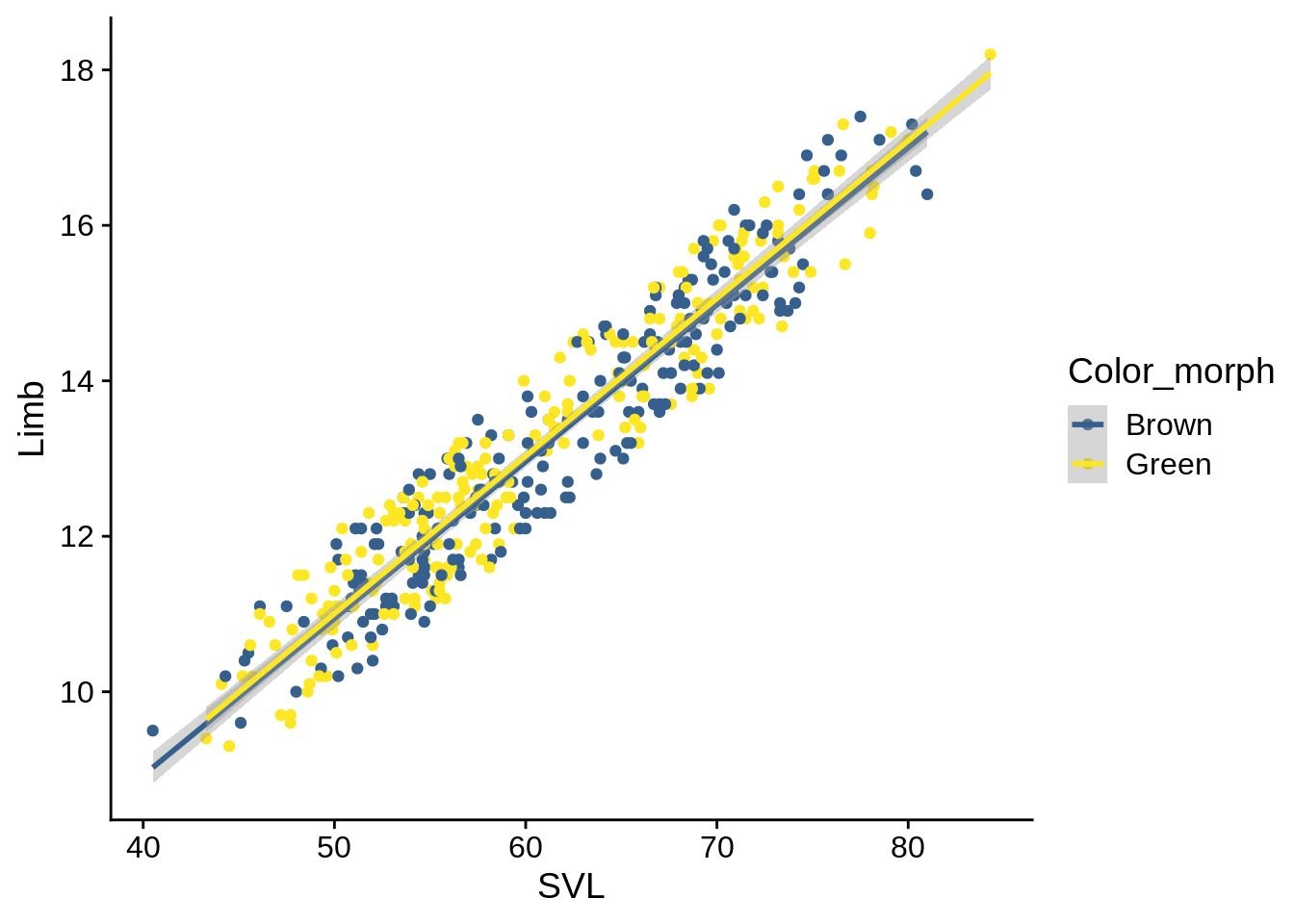
As you can see, the regression lines are almost indistinguishable.
What would an ANCOVA show if there are differences? Let’s see if color morph affects the Tail:Diameter relationship instead:
ancova_dia_blue =lm(Diameter ~ Tail * Color_morph, data = lizards_brown_blue)
print(ancova_dia_blue)
##
## Call:
## lm(formula = Diameter ~ Tail * Color_morph, data = lizards_brown_blue)
##
## Coefficients:
##          (Intercept)                  Tail       Color_morphBlue
##             20.38163               0.06444               7.91466
## Tail:Color_morphBlue
##              0.01617
summary(ancova_dia_blue)
##
## Call:
## lm(formula = Diameter ~ Tail * Color_morph, data = lizards_brown_blue)
##
## Residuals:
##      Min       1Q   Median       3Q      Max
## -13.5127  -2.9652   0.0357   3.2047  19.6002
##
## Coefficients:
##                      Estimate Std. Error t value Pr(>|t|)
## (Intercept)          20.38163    1.69334  12.036  < 2e-16 ***
## Tail                  0.06444    0.02863   2.251 0.024918 *
## Color_morphBlue       7.91466    2.32069   3.410 0.000709 ***
## Tail:Color_morphBlue  0.01617    0.03952   0.409 0.682632
## ---
## Signif. codes:  0 '***' 0.001 '**' 0.01 '*' 0.05 '.' 0.1 ' ' 1
##
## Residual standard error: 4.966 on 432 degrees of freedom
## Multiple R-squared:  0.4499, Adjusted R-squared:  0.4461
## F-statistic: 117.8 on 3 and 432 DF,  p-value: < 2.2e-16
lizards_brown_blue |> ggplot() + aes(x = Tail, y = Diameter, color = Color_morph) +
  geom_point() + geom_smooth(method = 'lm') + scale_color_viridis_d(begin = 0.3, end = 1)
## `geom_smooth()` using formula 'y ~ x'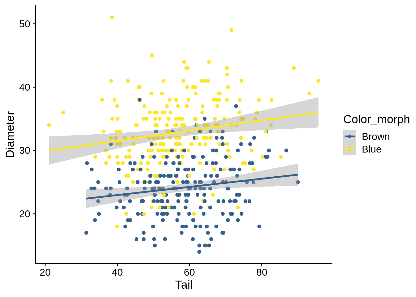
In this case, you can see that there’s a significant main effect but no significant interaction; this results in a separation between the two regression lines on the figure.
If you get this result, re-run the ANCOVA but replace the * with a +; this will remove the interaction effect and give you better estimate.
ancova_dia_blue_noint =lm(Diameter ~ Tail + Color_morph, data = lizards_brown_blue)
summary(ancova_dia_blue_noint)
##
## Call:
## lm(formula = Diameter ~ Tail + Color_morph, data = lizards_brown_blue)
##
## Residuals:
##      Min       1Q   Median       3Q      Max
## -13.6433  -2.9521   0.0416   3.1976  19.4588
##
## Coefficients:
##                 Estimate Std. Error t value Pr(>|t|)
## (Intercept)     19.88954    1.19088  16.701  < 2e-16 ***
## Tail             0.07293    0.01972   3.699 0.000245 ***
## Color_morphBlue  8.84397    0.47572  18.591  < 2e-16 ***
## ---
## Signif. codes:  0 '***' 0.001 '**' 0.01 '*' 0.05 '.' 0.1 ' ' 1
##
## Residual standard error: 4.961 on 433 degrees of freedom
## Multiple R-squared:  0.4497, Adjusted R-squared:  0.4472
## F-statistic: 176.9 on 2 and 433 DF,  p-value: < 2.2e-16
Biologically, you can interpret this as Blue lizards have a larger perch diameter than brown across a variety of tail sizes. Specifically, blue diameter is on average average 8.84 mm wider (you get this from the main effect coefficient of the no-intercept model).
When reporting this, be sure to provide the regression equation (Intercept and slope of Tail) and the main effect.
But what if you have a significant interaction? Let’s look at the Brown/Green comparison:
ancova_dia_green =lm(Diameter ~ Tail * Color_morph, data = lizards_brown_green)
print(ancova_dia_green)
##
## Call:
## lm(formula = Diameter ~ Tail * Color_morph, data = lizards_brown_green)
##
## Coefficients:
##           (Intercept)                   Tail       Color_morphGreen
##              20.38163                0.06444               -0.01528
## Tail:Color_morphGreen
##              -0.21839
summary(ancova_dia_green)
##
## Call:
## lm(formula = Diameter ~ Tail * Color_morph, data = lizards_brown_green)
##
## Residuals:
##      Min       1Q   Median       3Q      Max
## -10.4841  -3.2126   0.0082   2.9184  14.6412
##
## Coefficients:
##                       Estimate Std. Error t value Pr(>|t|)
## (Intercept)           20.38163    1.58128  12.889  < 2e-16 ***
## Tail                   0.06444    0.02674   2.410   0.0164 *
## Color_morphGreen      -0.01528    2.18355  -0.007   0.9944
## Tail:Color_morphGreen -0.21839    0.03695  -5.910 6.89e-09 ***
## ---
## Signif. codes:  0 '***' 0.001 '**' 0.01 '*' 0.05 '.' 0.1 ' ' 1
##
## Residual standard error: 4.637 on 438 degrees of freedom
## Multiple R-squared:  0.6635, Adjusted R-squared:  0.6612
## F-statistic: 287.8 on 3 and 438 DF,  p-value: < 2.2e-16
lizards_brown_green |> ggplot() + aes(x = Tail, y = Diameter, color = Color_morph) +
  geom_point() + geom_smooth(method = 'lm') + scale_color_viridis_d(begin = 0.3, end = 1)
## `geom_smooth()` using formula 'y ~ x'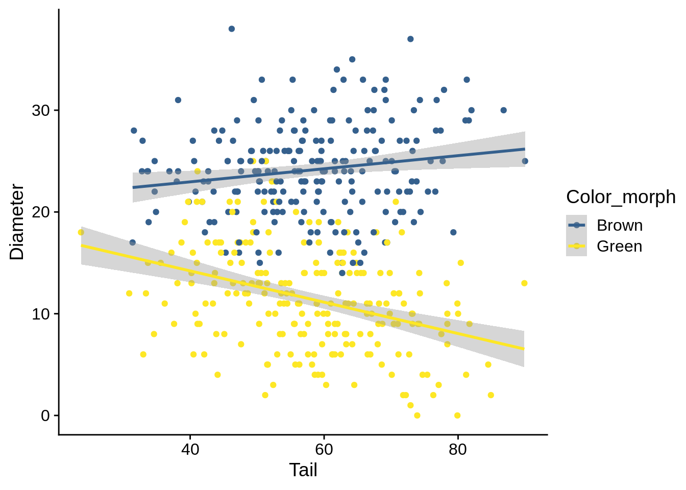
In this case, we have a significant interaction, which indicates that the relationship between Diameter and Tail is different between color morphs; the graph backs this up.
The main effect is not significantly different in this case, but that generally doesn’t matter (as it can’t be interpreted without the slope).
To understand and report this, it’s best to think of it as a pair of separate regressions.
The regression for Brown is determined by your Intercept and your slope (e.g., Diameter = Intercept + slope * Tail).
The regression for Green adds the Green-specific coefficients to those effects: Diameter = (Intercept + Color_morphGreen) + (Tail slope + Tail:Color_morphGreen) * Tail.
In this case, you’d report your regression slopes as:
Brown: Diameter = 20.38 + 0.06 * Tail Green: Diameter = 20.37 + -0.15 * Tail
You should also include the \(R^2\) and the p-values for the non-intercept coefficients for both cases.
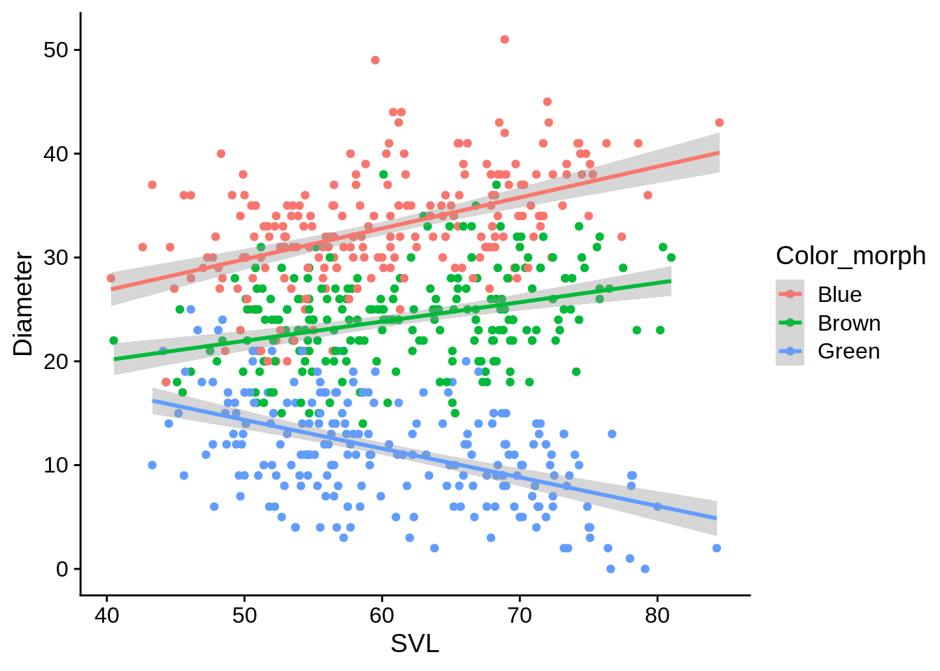
ggplot(lizards, aes(x = SVL, y = Diameter, color = Color_morph)) +
  geom_point() +
  geom_smooth(method = 'lm')
## `geom_smooth()` using formula 'y ~ x'