3 Figures and Tables
Good figures are one of the most important parts of a manuscript. When learning to write scientific papers, some might view figures as an afterthought. This is a mistake. The figure should tell a fairly complete story. Combined with its caption, the reader should be able to look at the figure immediately after reading the abstract and have a general sense of what’s going on.
Tables are also an important part of a paper’s results, but good figures are usually easier to interpret by the reader.
Note that this chapter focuses on general guidlines for figure design.
For instructions on how to create figures in R using ggplot2, see Chapter @ref(r_ggplot).
The R code used to generate all of the figures in this chapter can be found here, along with some annotations.
3.1 Captions
Figures and tables require captions that explain what they represent. Captions should be below figures and above captions. The first “sentence” of a caption shouldn’t actually be a sentence; it’s more of a description. See the various examples in this chapter for more details.
The caption should help the figure or table stand alone from everything else. If there are abbreviations or acronyms in the figure, they should be defined in the caption. If your figure is related to a statistical test, you should present the results of the test in the figure caption. If there’s a line of best fit in a scatterplot figure, this means that a linear regression was performed behind the scenes; you should report the details.
Note that figures in your manuscript should not have titles. This information belongs in the caption.
3.2 Figures
Make sure the caption (and legend, if present) gives enough information that the reader can understand exactly what the figure/table represents without having to look at the text. DO refer to all tables/figures in the body of the text, and include them in order (i.e. the first table/figure the reader comes across should be called table 1/figure 1 and should be the first one referred to in the text). Note that in this chapter, the figures are numbered 3.1, 3.2, etc; this is appropriate for a multi-chapter book, but not for a paper/article/manuscript. Don’t use decimals.
Figures should communicate your results, not just present/summarize your data. A good figure tells a story. If there is a trend or pattern, it should be designed to emphasize it.
3.2.1 Specific Figure Guidelines
Figure design is communication, so you want to make the result/message as obvious as you can. The longer a reader has to stare at your figure before “getting it,” the more likely they are to get bored or stop caring.
- Avoid large amounts of empty white space. For categorical data, you should remove categories that have no data unless their absence is somehow important and interesting.
- For example, if you are surveying trees and a species is not observed, there’s no reason for it to be in the figure.
- Is your figure emphasizing what it should?
- If you’re contrasting two groups, are they clearly contrasted? Could re-ordering the groups improve the contrast?
- If you’re comparing groups of frequencies, you should order them from highest to lowest frequency.
- If you are trying to show a trend, is it being adequately emphasized?
- Please note that this doesn’t mean cheating, or changing the data.
- The axes and legends should be clear.
- Often, the default axis or legend names will be the label of a specific cell or column. You can change these defaults.
- Consider how your figure will look to other people.
- How will it look if printed from a black and white printer?
- Hint: the default blue and orange colors in Excel are indistinguishable in gray scale; the same is true for the default ggplot2 palette in R.
- How would it look to someone with color blindness? -If using R, the Viridis color scales work nicely for this.
- How will it look if printed from a black and white printer?
Please remember that you should be writing your lab reports as if the reader (i.e., me) didn’t know exactly what you did.
3.2.2 Be Concise
If you have multiple figures that conceptually belong together (e.g., the same measurements taken in three years), you should turn them into a single multi-panel figure. Label your the panels with letters in the upper left corner; the caption should explain how the panels are different.
3.3 Some Example Figures
3.3.1 General Formatting
Figure 3.1 is poorly formatted:
- The colors are hard to distinguish when printed and black and white;
- The axis and legend text are showing the default labels instead of informative values;
- There is a lot of white space, partially due to a bad y axis scale;
- The equation is in the figure instead of the caption;
- The caption is vague and uninformative;
- There is an unnecessary title;
- There are grid lines;
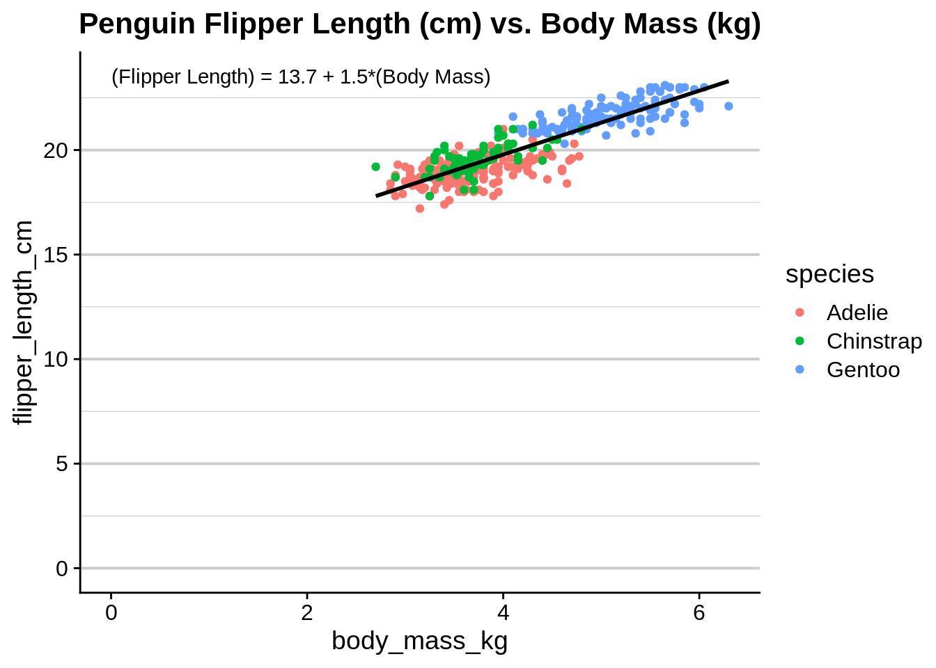
Figure 3.1: Body mass (X variable) vs flipper length (Y variable). The regression is significant (\(R^2 = 0.76\); \(p<0.0001\)).
Figure 3.2 contains the same data, but has been reformatted to address these issues. Note the use of units in the axis labels, the formatting of scientific species names, the positioning of the legend to minimize whitespace, and the lack of a title and gridlines. This is also an example of how to plot data with a continuous response and a combination of continuous and categorical predictors.
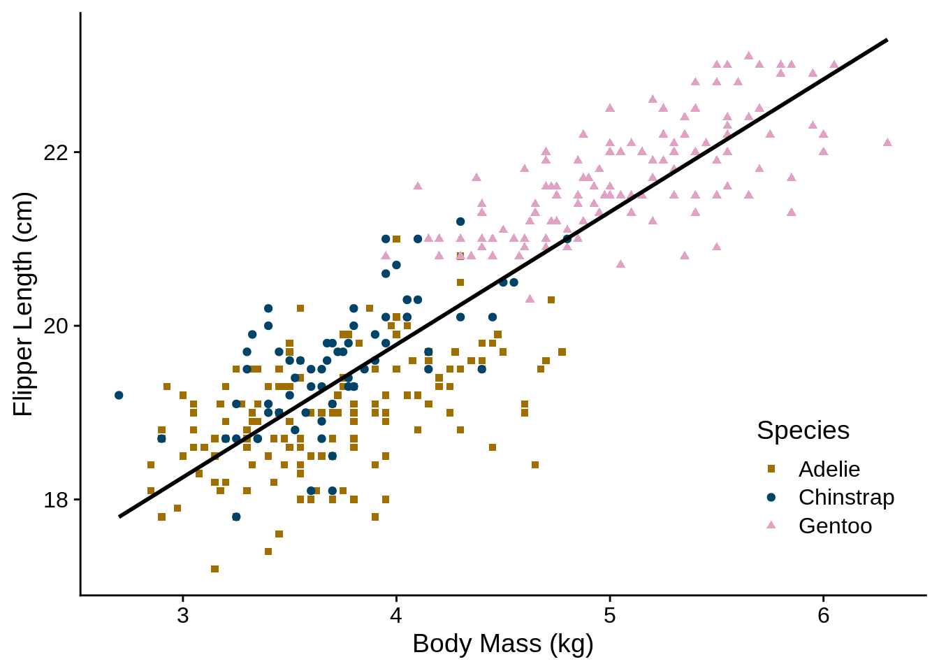
Figure 3.2: Association between body mass and flipper length in three species of penguin. Flipper length increases with body mass ((Flipper Length) = 13.7 + 1.5*(Body Mass); \(R^2 = 0.76\); \(p<0.0001\)).
Figure 3.3 is an example of a multi-panel figure; in the text, you should refer to parts of it as Figure 3.3A, 3.3B, etc.
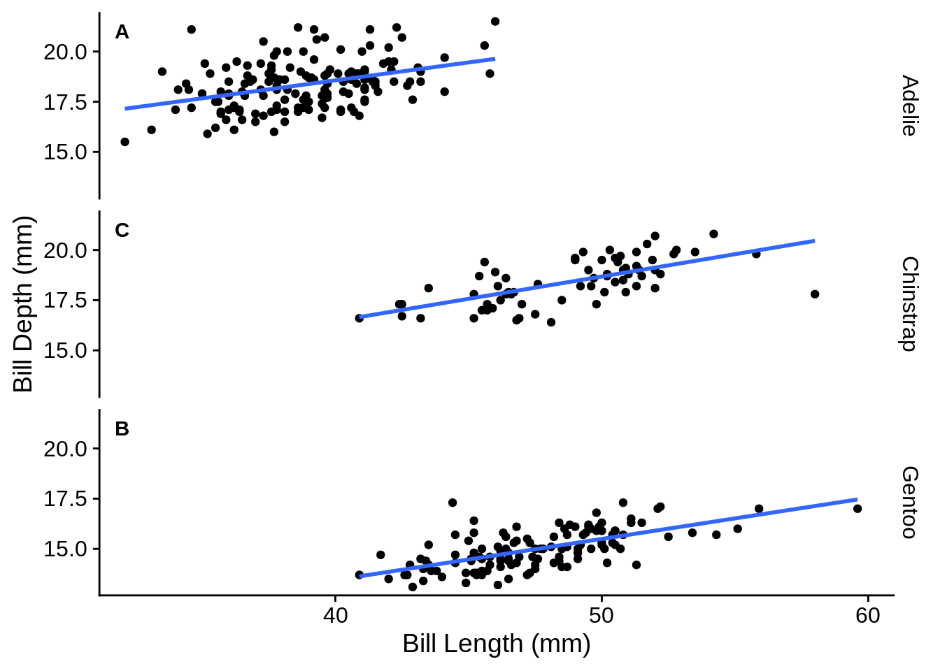
Figure 3.3: Association between bill length and bill depth for three species of penguins. The association is significant and different among species ((Bill Depth) = 10.6 + 0.2*(Bill Length) for Adelie, 5.5 + 0.2*(Bill Length) for Gentoo, and 8.7 + 0.2*(Bill Length) for Chinstrap; \(R^2 = 0.77\); \(p_{\text{species}} < 0.0001\); \(p_{\text{length}} < 0.0001\);)
3.3.2 Continuous response, categorical predictors
There are a number of options for representing continuous data grouped into multiple categories. You should avoid “dynamite” plots (Figure 3.4), which use a bar with error lines to represent a mean and standard error; these figures use a lot of space to provide very little information. A better option is to use box plots (Figure 3.5), which show the median, quartiles, range, and outliers of each group. Equivalently, you could use a group of histograms (Figure 3.6). A particularly effective way to visualize this type of dataset shows the distribution of the data and the summary statistics (Figure 3.7).
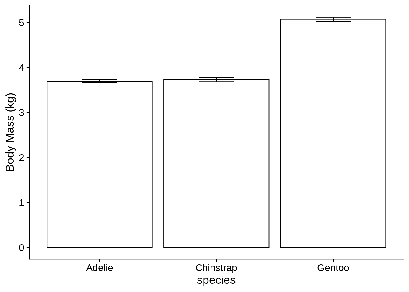
Figure 3.4: Mean body mass for three species of penguin, with standard errors. Body mass differs significantly among species \((p < 0.0001)\).
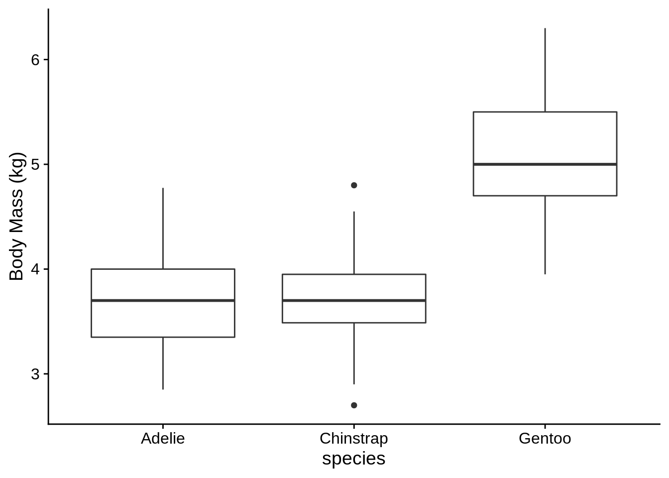
Figure 3.5: Distribution of body mass for three species of penguin. Body mass differs significantly among species \((p < 0.0001)\).
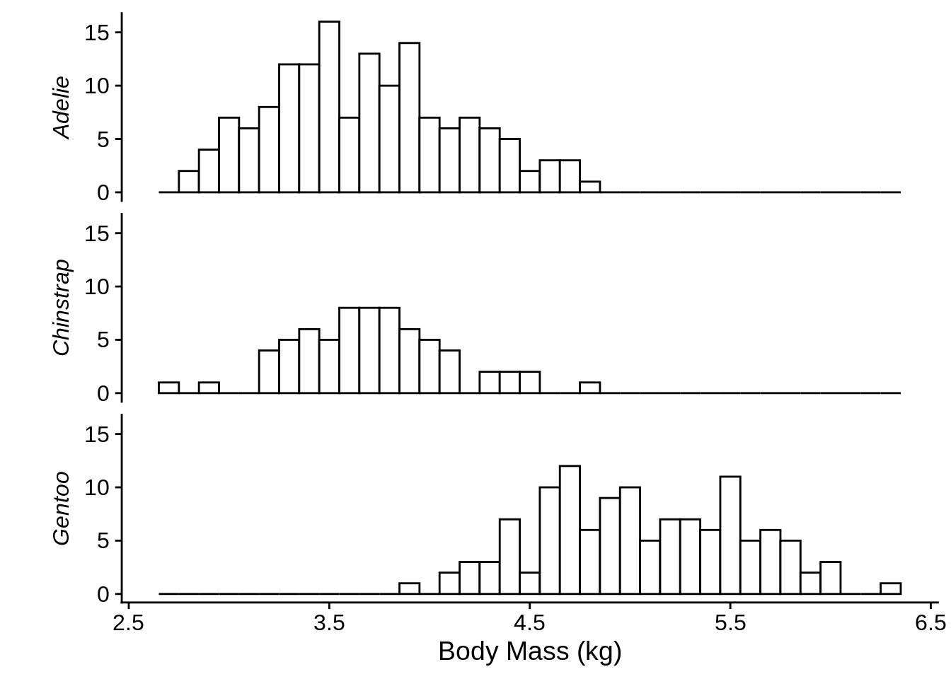
Figure 3.6: Distribution of body mass for three species of penguin. Body mass differs significantly among species \((p < 0.0001)\).
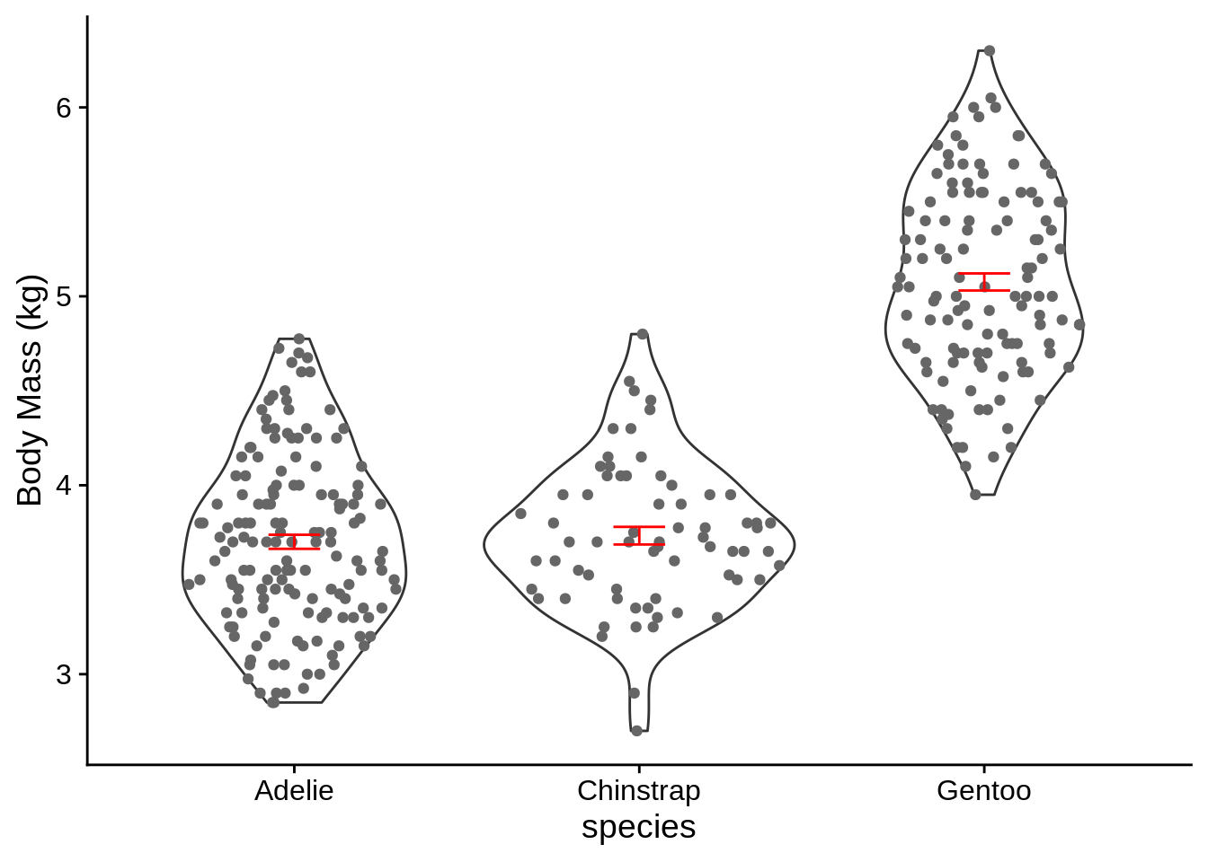
Figure 3.7: Distribution of body mass for three species of penguin, with mean and standard errors in red. Body mass differs significantly among species \((p < 0.0001)\).
3.3.3 Categorical, count, or frequency responses
These sorts of data usually involve examining how counts or frequencies differ among groups; they’re often associated with \(\chi^2\) tests. Generally, it’s best to represent these sorts of data with bar graphs (avoid pie charts). When making a bar graph, it’s a good idea to arrange your data to emphasize any trends. The species in Figure 3.8 are organized alphabetically, which obscures any trend. A better option is to organize by decreasing frequency of either total counts (like in Figure 3.9) or of one of the groups (Figure 3.10). These make it easier to detect patterns.
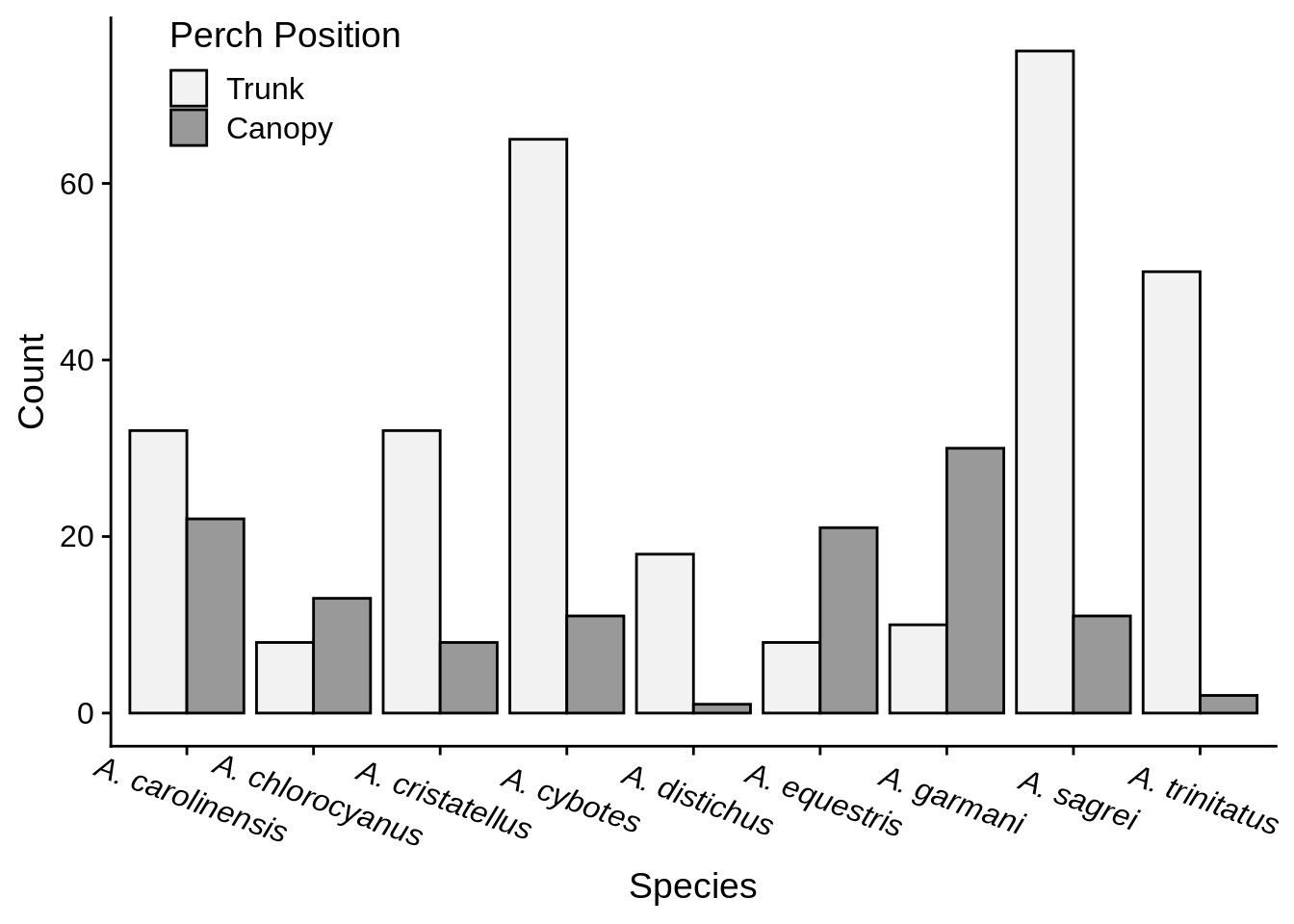
Figure 3.8: Number of Anolis captured from canopy and trunk perches.
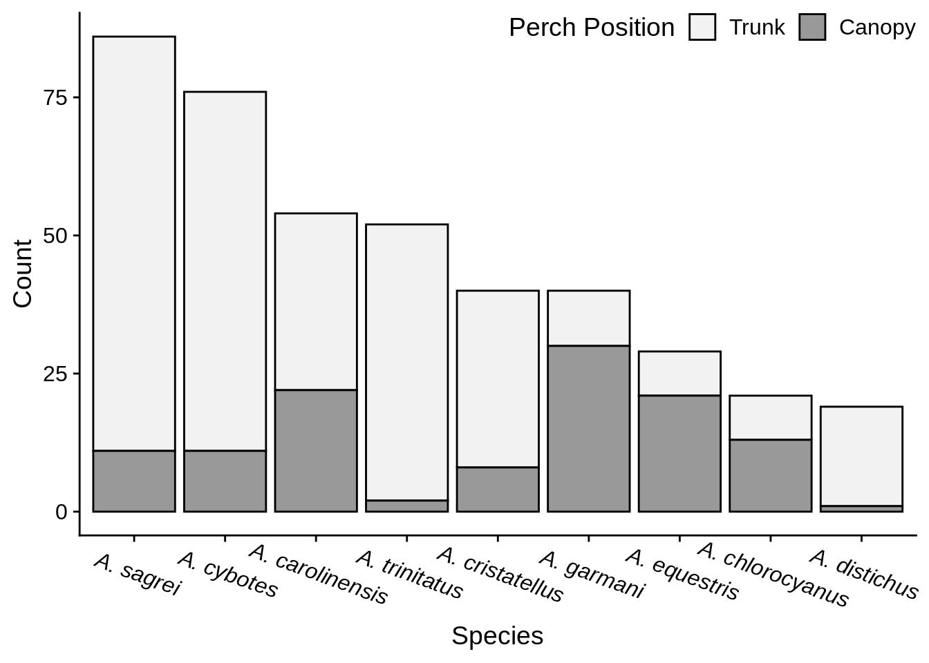
Figure 3.9: Number of Anolis captured from canopy and trunk perches.
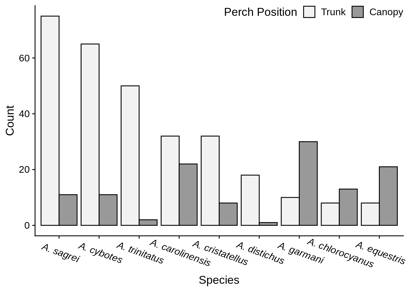
Figure 3.10: Number of Anolis captured from canopy and trunk perches.
An important consideration is whether to represent your data with counts or proportions (AKA frequencies – vary from 0 to 1). There are pros and cons to both approaches, but frequencies are usually better if the number of observations differs among your groups (compare Figure 3.11 with Figure 3.10). Be careful when calculating frequencies, because you may inadvertently end up making a graph that isn’t answering the question you’re trying to ask. For example, Figure 3.11 shows how anole frequencies differ between perch types, but Figure 3.12 shows the frequency at which each species occupies the two perches.
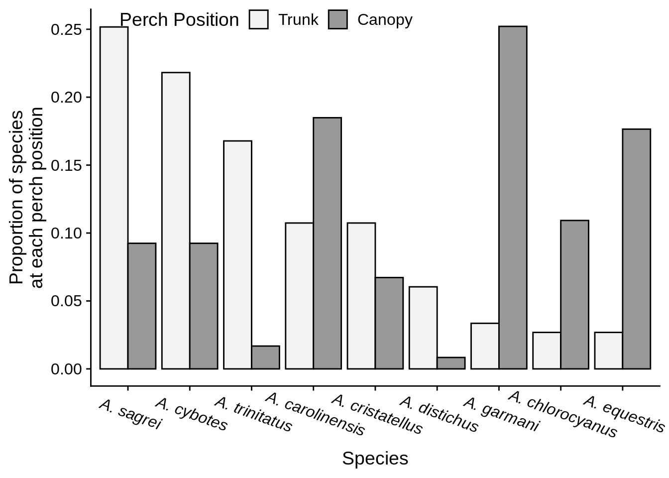
Figure 3.11: Frequency of Anolis species captured from canopy and trunk perches.
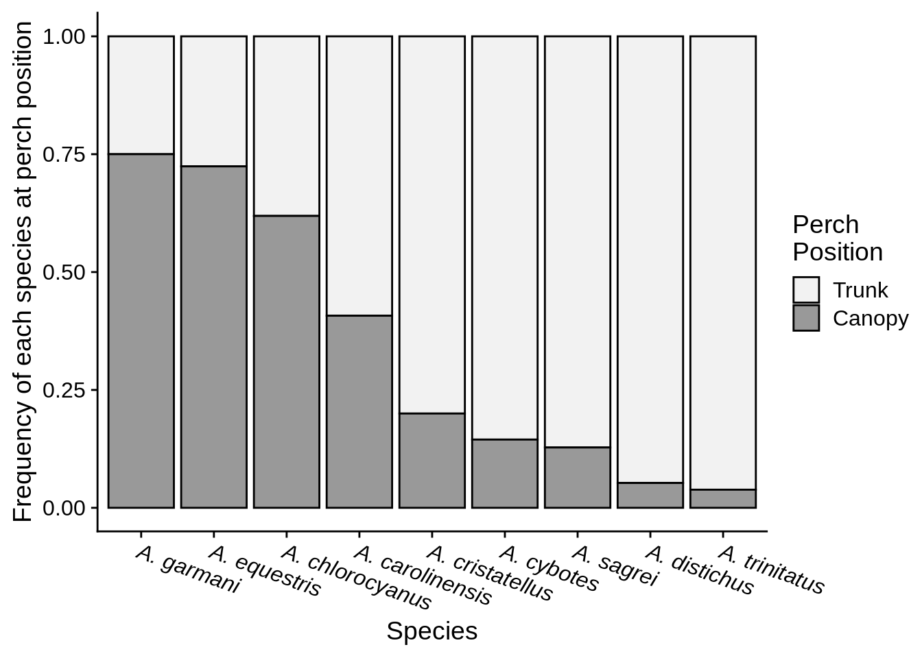
Figure 3.12: Perch frequency for 9 species of Anolis.
If there is some aspect of your data that you’d like to really emphasize, it can help to get more creative with your figures. For example, the most visually striking parts of Figure 3.13 are the colored sections of the bars, which correspond to the direction and magnitude of the difference between perches for each species. Do note that making more complicated figures may require extra explanation in the caption.

Figure 3.13: Number of Anolis found at each perch position. The white bar indicates the count at the less frequent perch, the total height is the count at the more frequent perch, color indicates which perch the species was more common at, and the size of the colored regions indicates the difference between perches.
3.4 Tables
Tables are an effective addition to a manuscript when you have a lot of data in the text and want to present it to the reader in an organized fashion. They are particularly helpful when you have a lot of different kinds of data that would be hard to plot together. For example, see Table 3.1.
Tables are best for highly structured data. If there isn’t much data to present, the data can usually just be presented in the text of the results. If there’s a lot of data, it is worth considering if a figure would be better.
| Group | N | Mean | Std. Dev. | Min. | Max. |
|---|---|---|---|---|---|
| A | 10 | 35.33 | 3.53 | 30.74 | 37.02 |
| B | 15 | 42.61 | 4.62 | 36.36 | 49.17 |
| C | 12 | 22.00 | 2.97 | 17.99 | 26.38 |